


Americans Are In Love With Stocks
Is this a bullish or bearish signal?
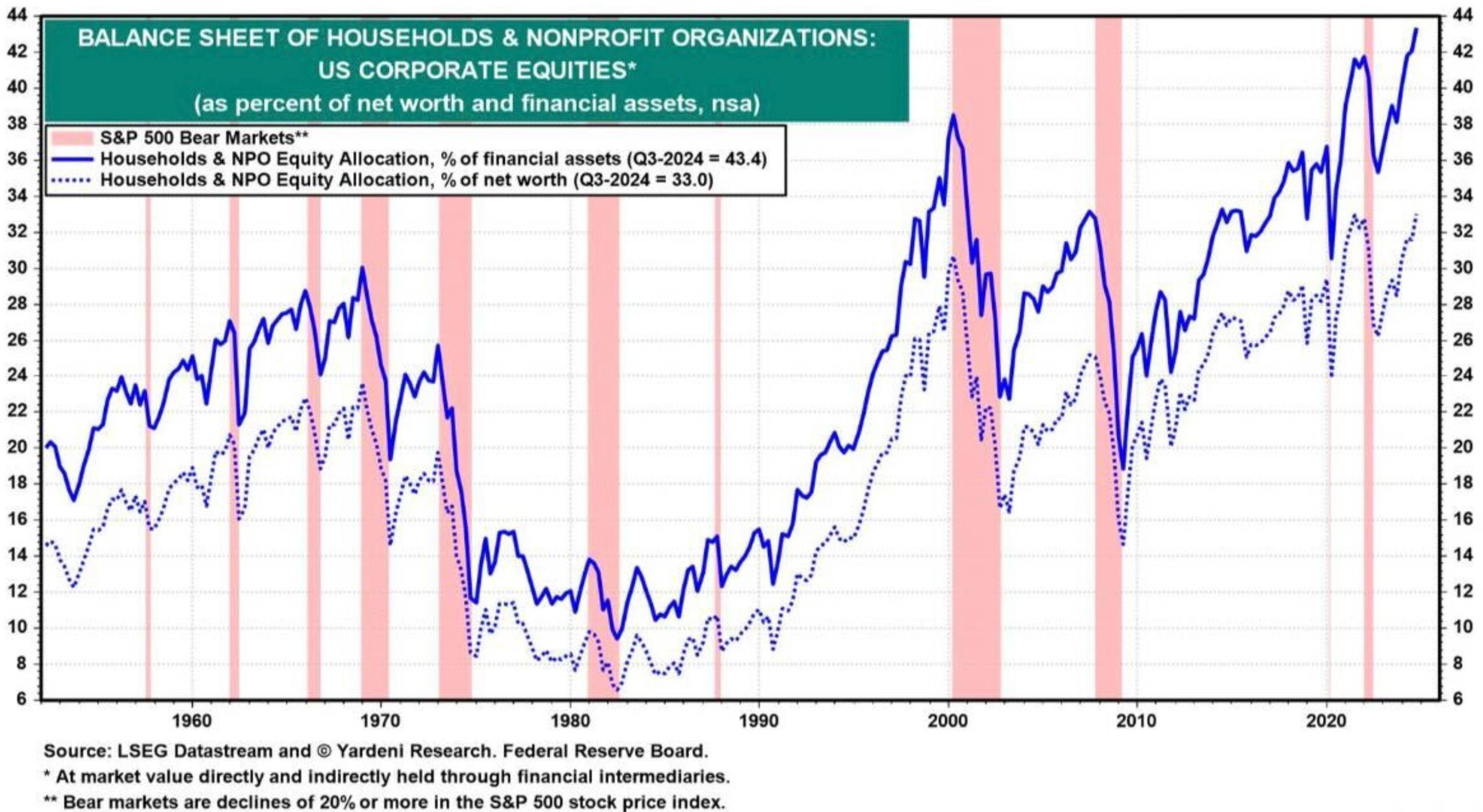
U.S. household allocation to stocks just hit an all-time high of 43.4%. This surpasses the previous record of 41.7% in 2021 and even the 38.5% in 2000.
Americans have 43.4% of financial assets and 33% of their net worth in stocks. Both the most in history.
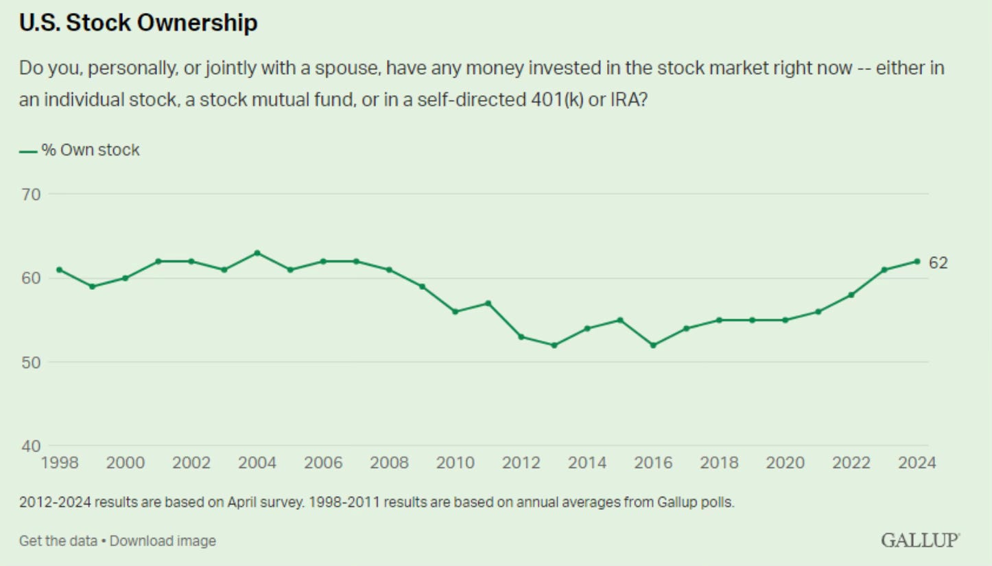
Gallup’s annual survey found that 62% of U.S adults have money invested in the stock market, including individual stocks, a stock mutual fund or a retirement savings account. Also near the highest levels on record.
Americans have fallen in love with stocks. But should we really be surprised?
The stocks market still is sitting near all-time highs. It has been in a bull market for two years and it just finished a year in which the S&P 500 set 57 new all-time highs. If you’re not bullish now, when would you be?
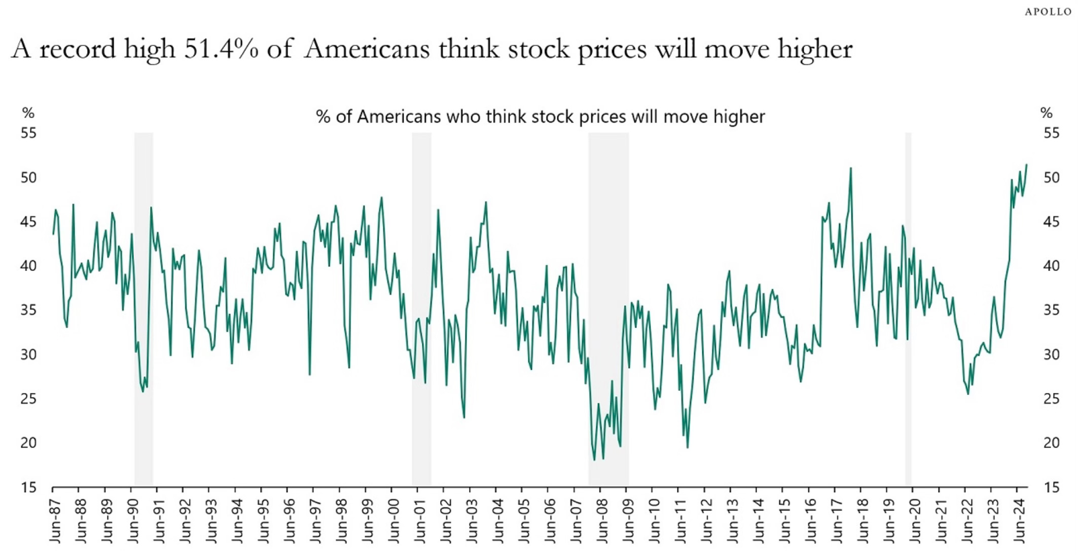
That would explain why a record 51.4% of Americans think that stock prices will move higher.
So does this much love for stocks paint a bearish or bullish setup moving forward?
On one hand, many are pointing to the fact that this is a sign of a top. “What goes up must come down.” “Everything is extended.”
On the other hand, some say that this has no correlation to when the stocks market peaks or crashes.
I think both views have plausible arguments. If I’m taking a side, to me it skews bullish. It’s a bull vs bear debate that will continue. This is another data point that can be dissected and it allows investors to form their own conclusions and guesses. They can vote with how they invest.
One area that I will point out that I believe is a reason for the continued rising allocation to stocks, is the improved financial literacy of people. Understanding the importance of investing and being invested in the stocks market is more understood now than any other time in history.
A great job has done by the financial industry to create awareness and education around investing and the importance of it. Retirement plans are now offered at most workplaces and it’s easier than ever to buy stocks. People understand the benefits and reasons to invest. And that’s a great thing!
I wanted to share a few of my favorite charts on why to invest.
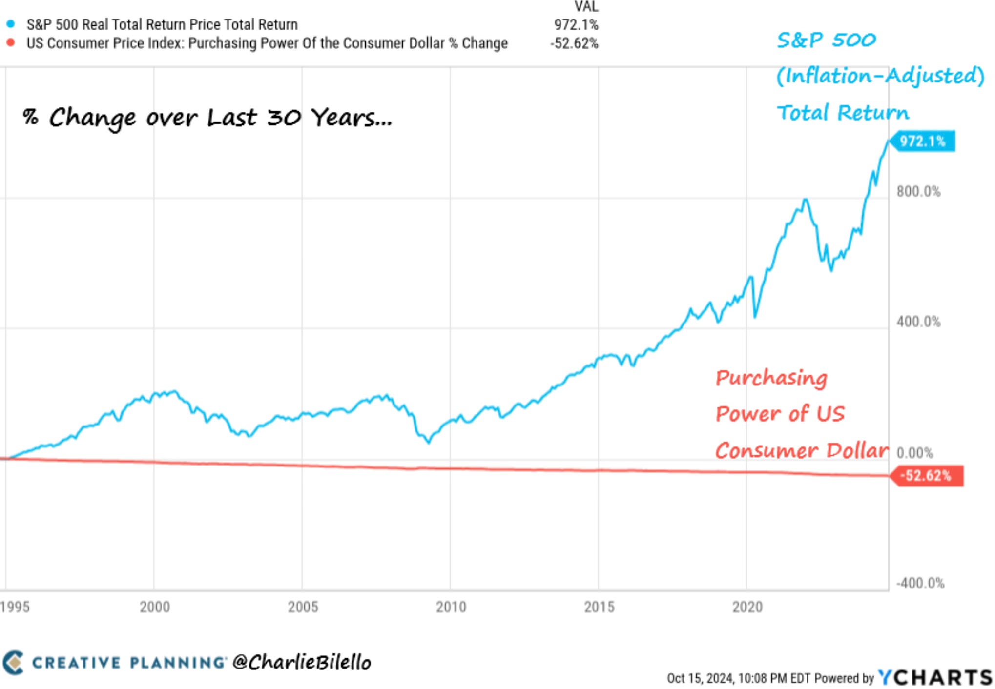
I like this chart from Charlie Bilello. Very simply, why you need to invest in one chart.
Over the last 30 years, the purchasing power of the US consumer dollar has been cut in half due to inflation. At the same time, the S&P 500 has gained 972% (8% per year) after adjusting for inflation.
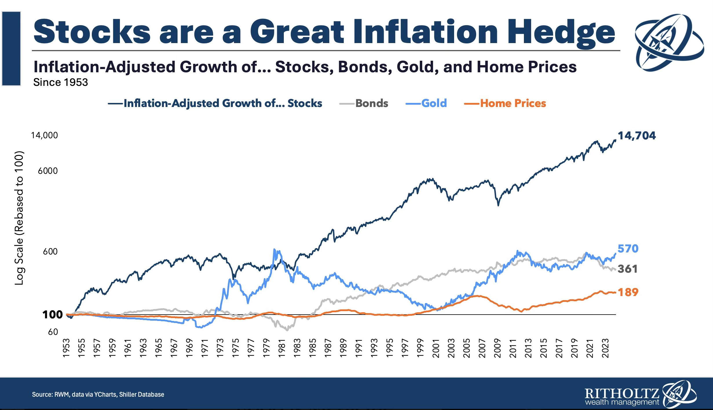
The second is from Barry Ritholtz. It shows just how good of an inflation hedge stocks are. Again, another reason why you need to invest.
The best hedge AGAINST inflation? Equities. When Inflation drives prices higher, that shows up in Revenues and Profits too. Higher revs & net income mean higher equity prices. Chart showing Stocks, Bonds, Gold, Houses + Equities since 1953.
The Coffee Table ☕
I had to share a wonderful post that Jonathan Clements wrote called Four Questions. I will let his description of the piece speak for itself.
“Seven months into my battle with cancer, here are four questions I’ve been asking myself—questions, I suspect, that might also be interesting to those who aren’t facing a terminal diagnosis.”
Josh Brown wrote an interesting post about dividends. Dividends are a feature, nothing more It’s an interesting read as this is the same view that I’ve had on dividends. Many put way too much weight into dividends and they miss the bigger picture.
I found this tax reference guide from Creative Planning to be quite beneficial. It’s loaded with valuable information.
Source: Charlie Bilello
Thank you for reading! If you enjoyed Spilled Coffee, please subscribe.
Spilled Coffee grows through word of mouth. Please consider sharing this post with someone who might appreciate it.