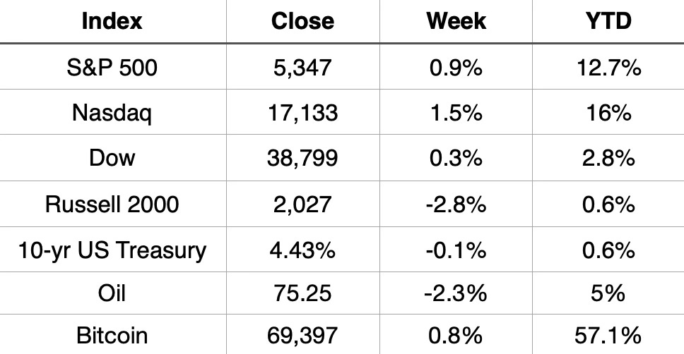
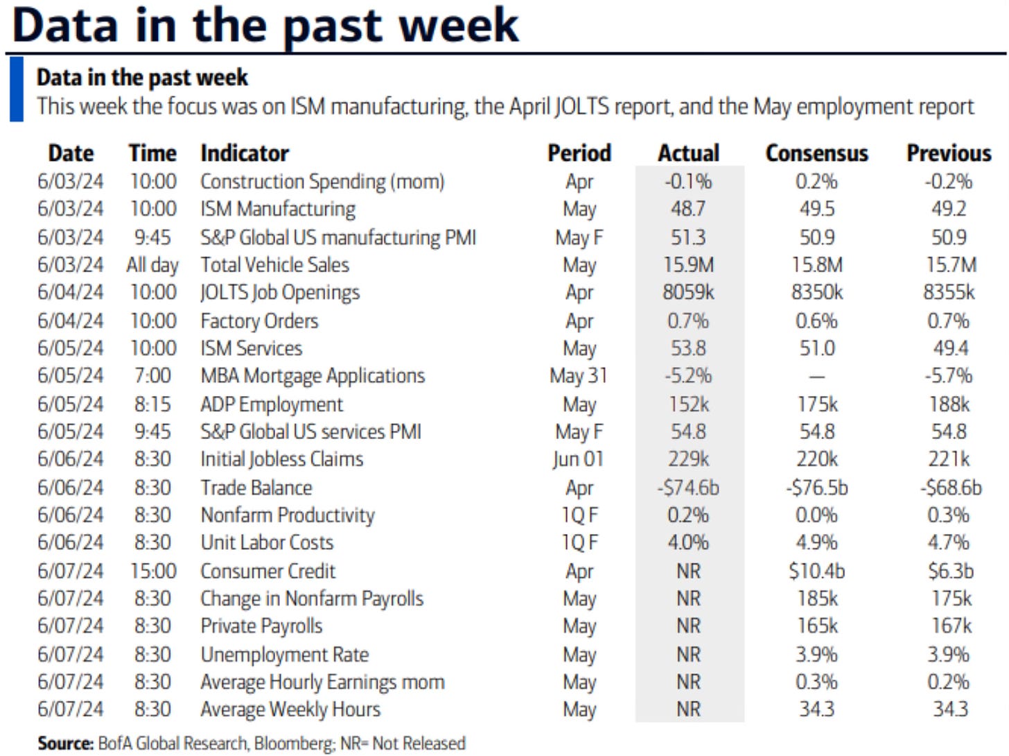
This week ended with the May jobs report on Friday.
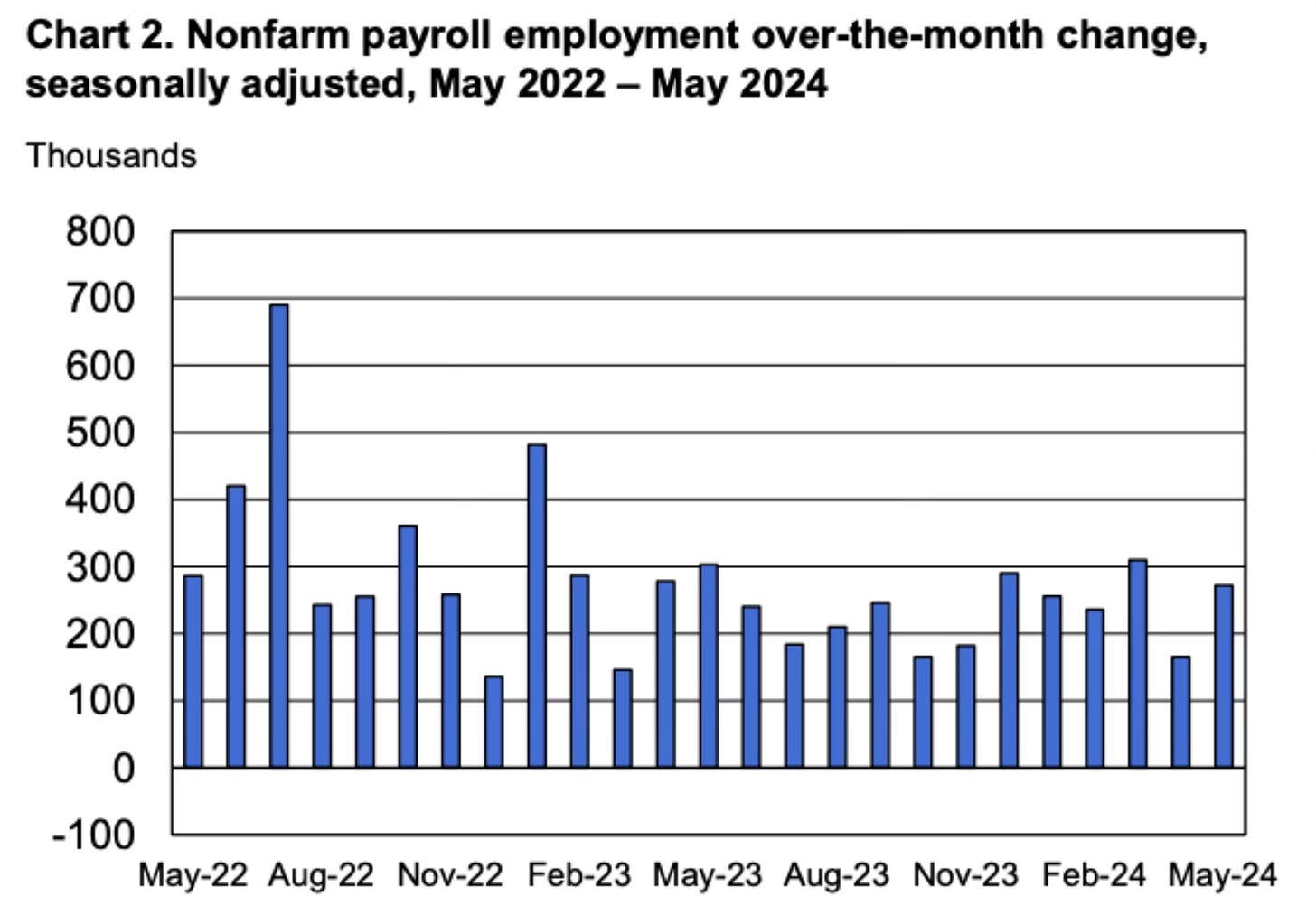
It turned out to be a rather strong report. The US economy added 272,000 jobs. That beat the estimated 190,000 by a wide margin.
The unemployment rate did tick up to 4%. That’s the highest level since January 2022. The streak of 27 straight months of unemployment under 4% came to an end.
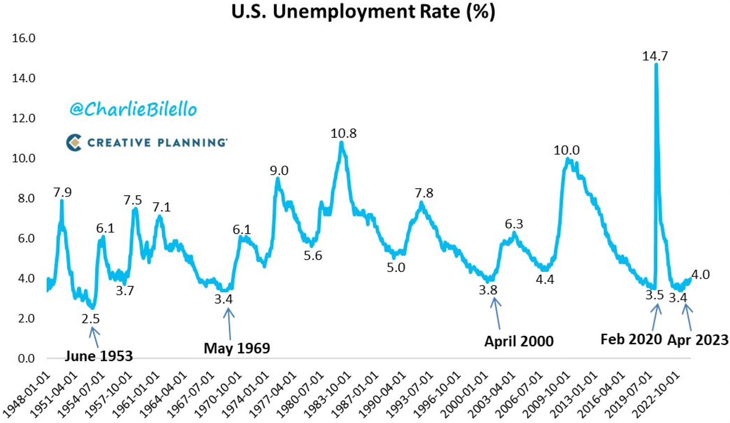
I think it’s clear the economy is still strong but is showing some weakening. With unemployment rising, I would expect the Fed to start shifting towards a rate cut.
The stock market didn’t really have much of a reaction to the jobs report. All three major indices were down slightly on Friday but all finished up on the week.
The Nasdaq has now been up in 6 of last 7 weeks. This week also saw a 25th all-time high for the S&P 500 for 2024.
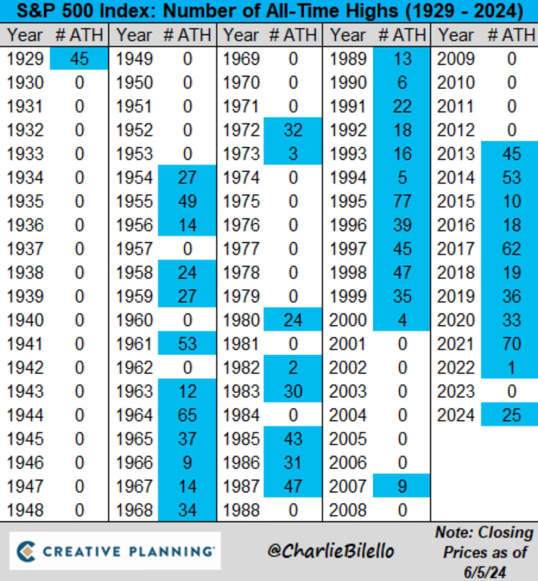
The market is still on a smooth road as there has now been 322 days since we’ve had a 2% or more down day.
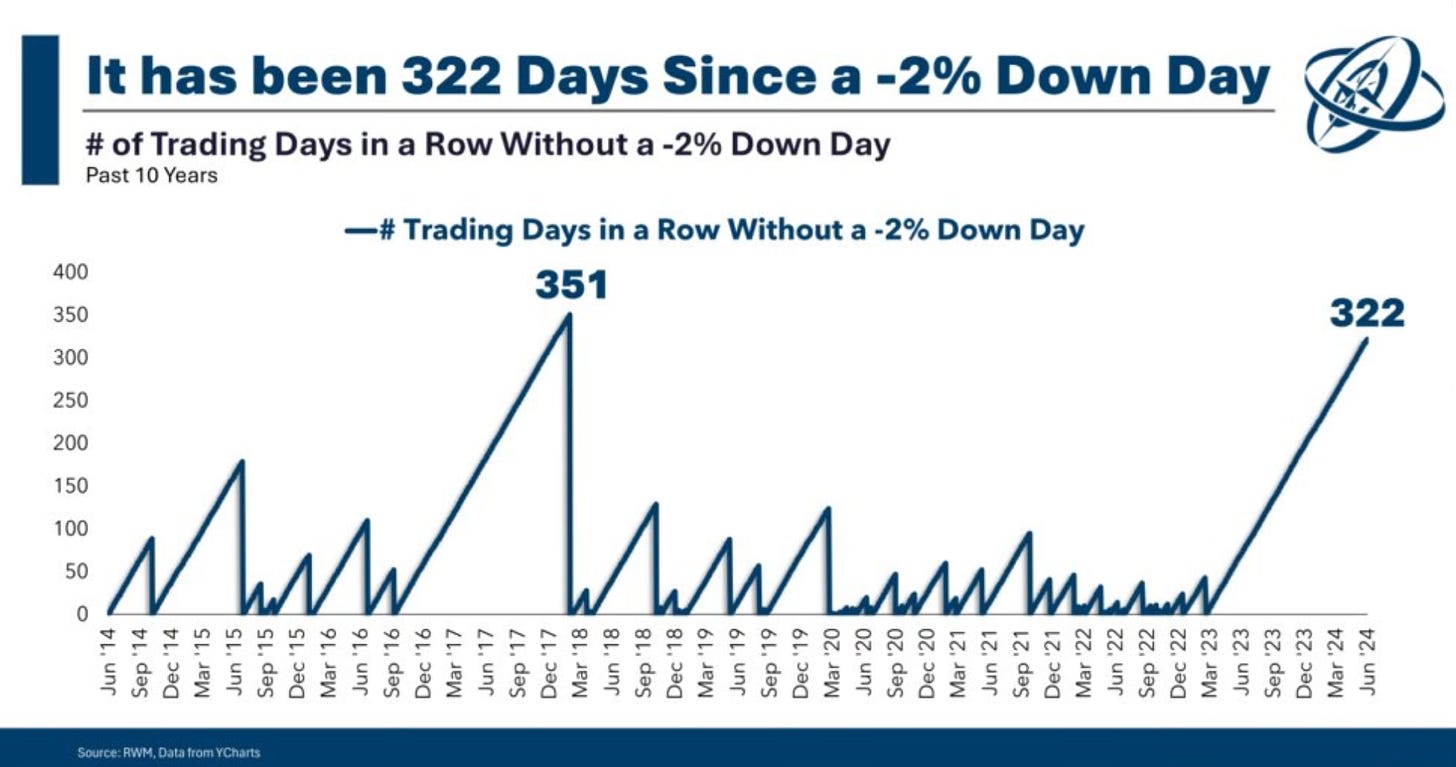
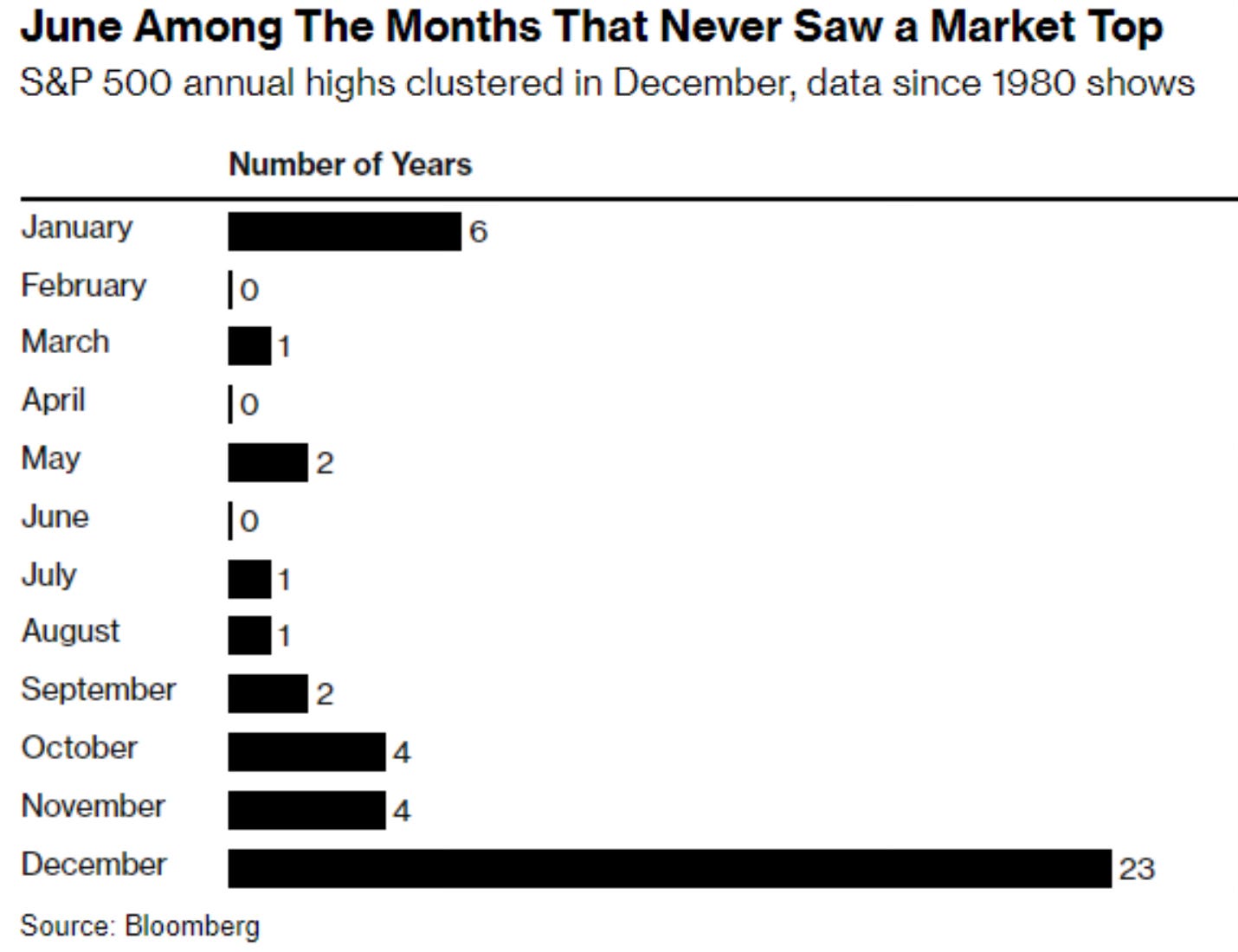
The month of June is also a month that hasn’t provided any memorable downturns or volatility. June has actually never experienced a market top. The end or beginning of the year is when that has traditionally occurred.
Market Recap
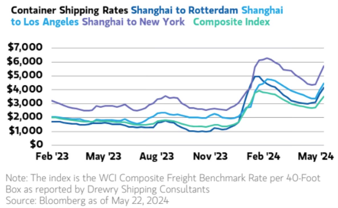
Shipping Container Rates Jump
A chart that jumped out to me this week was what has happened to container shipping rates. The key shipping routes are seeing some rather drastic price jumps. Not anywhere near the 2001 peak, but this is something that is now on my radar.
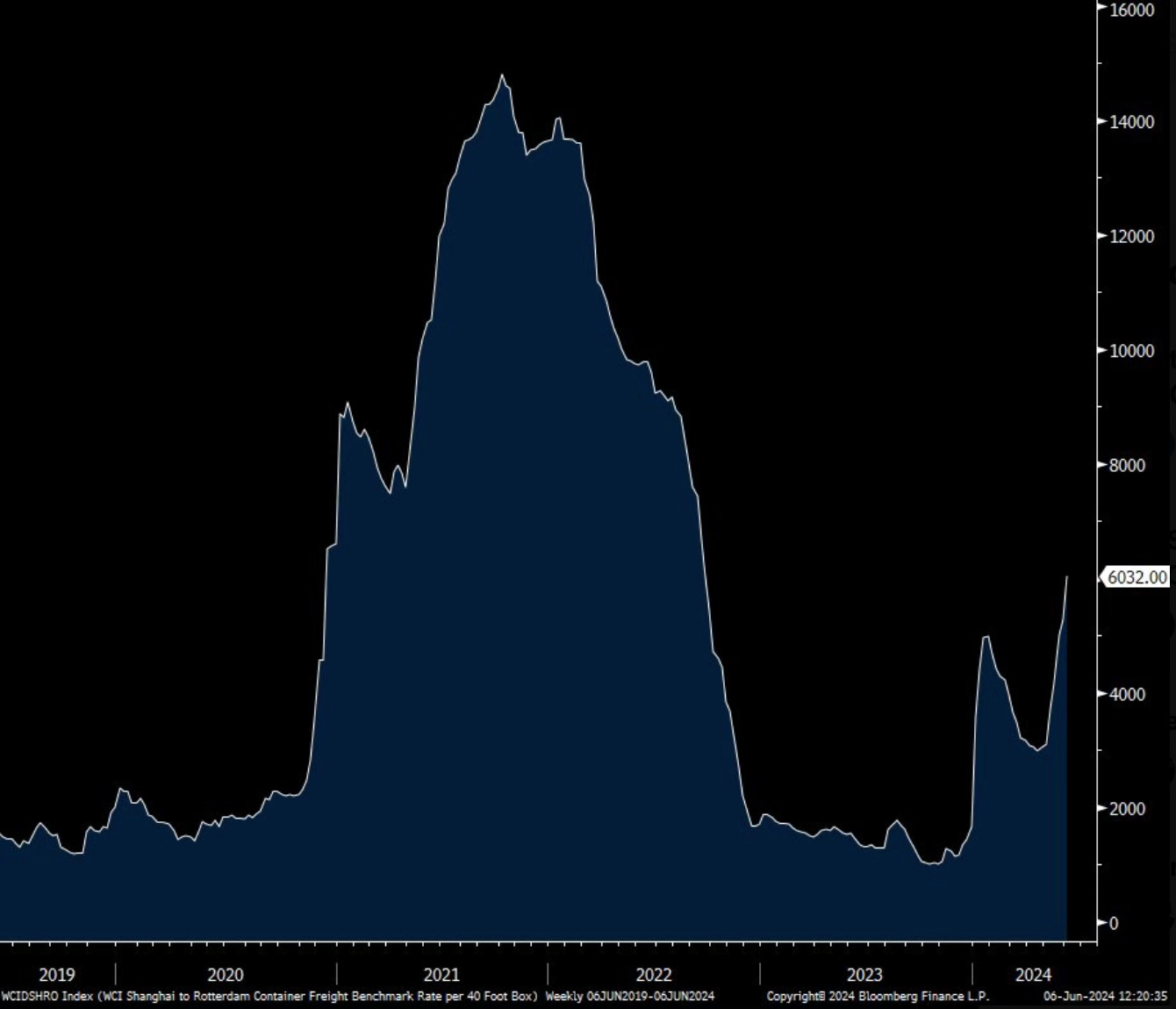
Here is a farther out view of shipping container rates from Peter Boockvar, where he notes in one week it rose 15%.
Small-Cap Weakness
Small cap weakness continued this week with the IWM (iShares Russell 2000 ETF) down 2.87%.
This now makes more than 600 consecutive days that the Russell 2000 has been down by 10% or more from its all-time high.
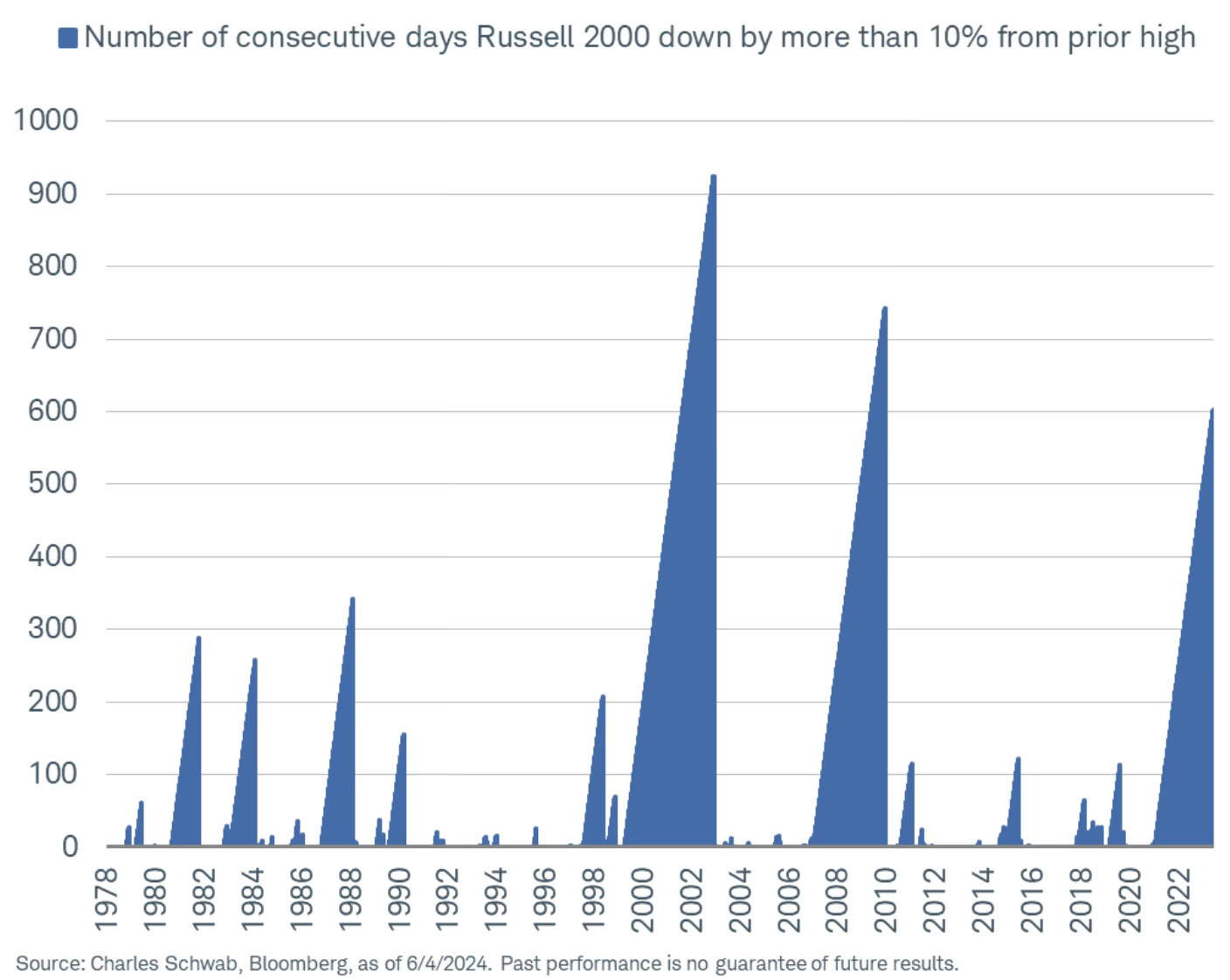
This chart points out that this is the 3rd longest day count without a new all-time high and the 4th biggest drawdown since 2000. Just continued struggles from small caps.
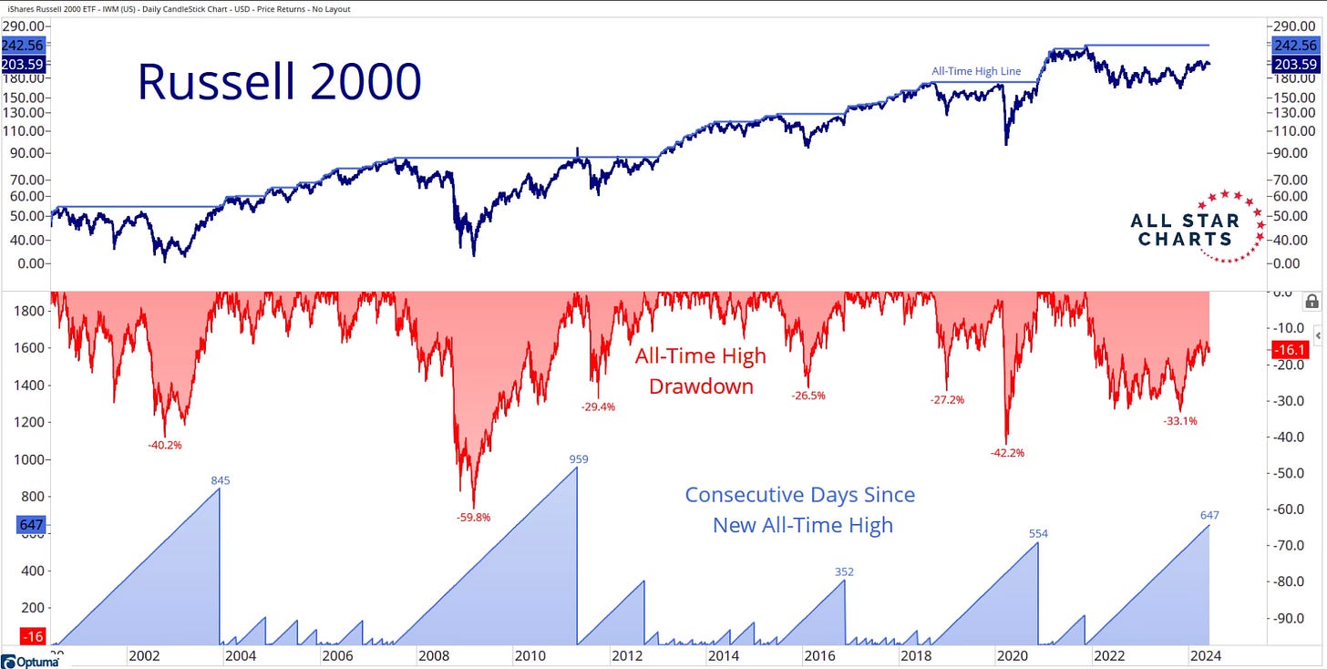
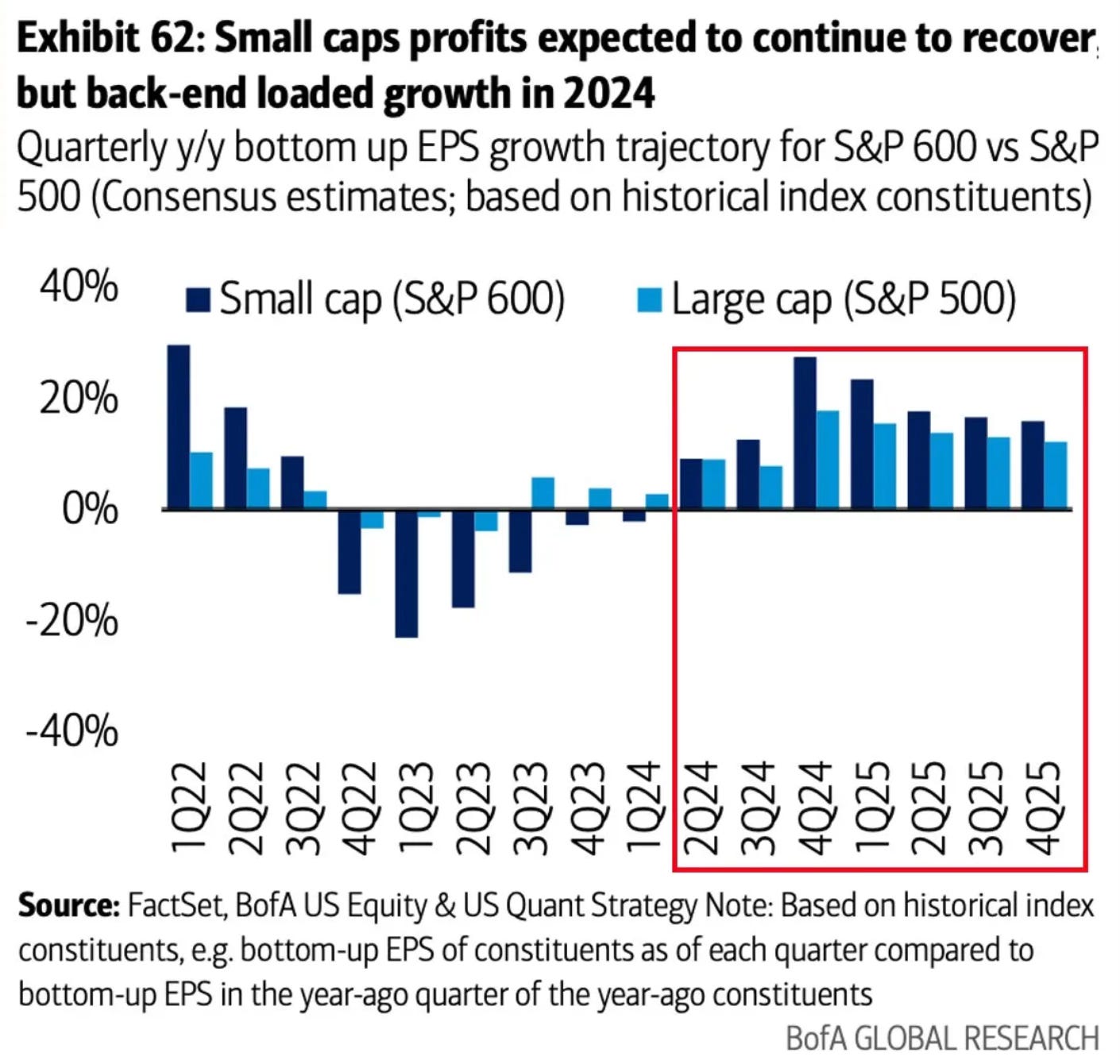
That trend could very well see a change upcoming. Other than fuel to small caps from a rate cut. Small caps are expected to outpace the S&P 500 in YOY EPS growth over the coming quarters. Participation from small caps eventually almost has to arrive at some point you would think.
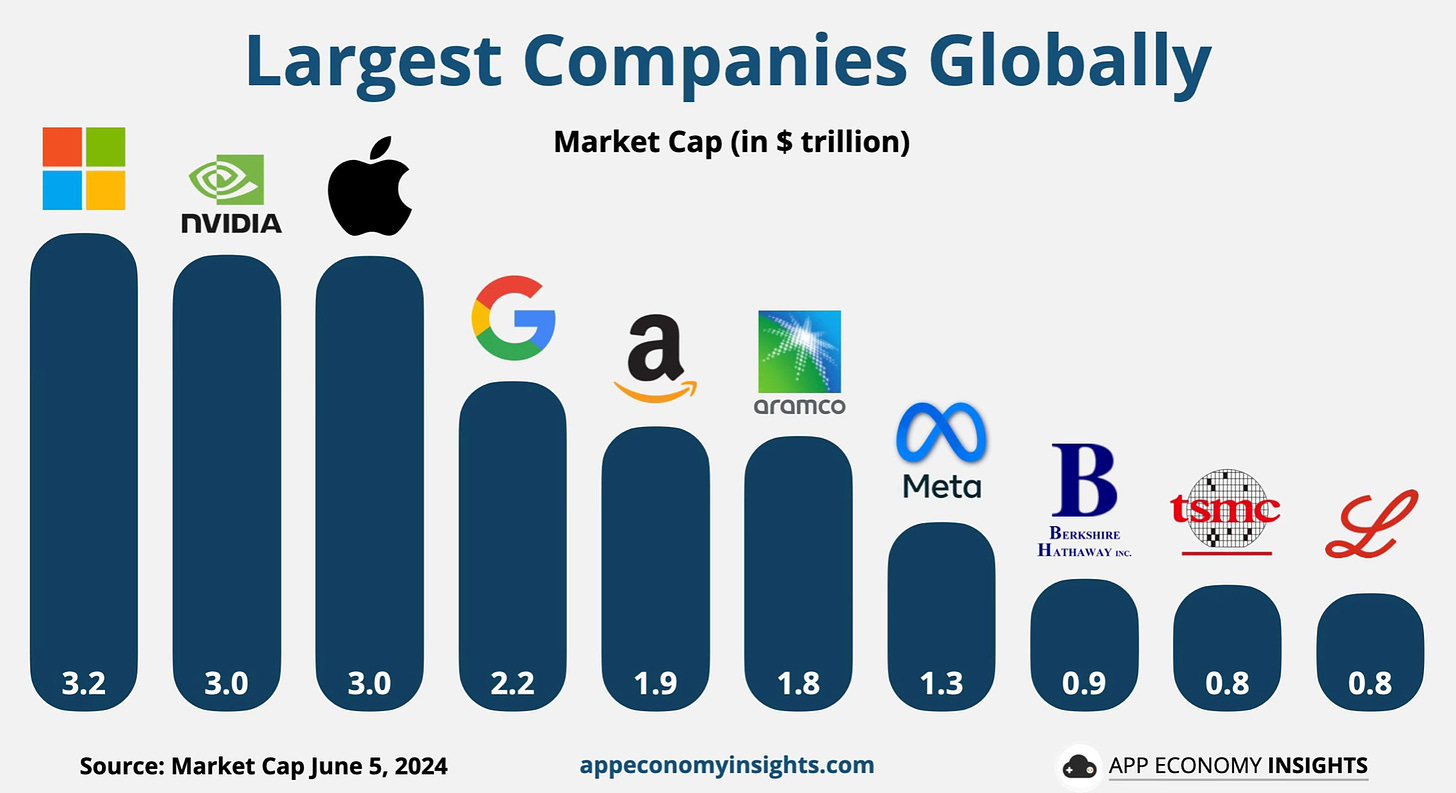
Nvidia Passes Apple
The Nvidia surge just continues on. This week it surpassed Apple as the 2nd largest company in the world. YTD it’s now up 150%. The past 2 years it’s up 548%
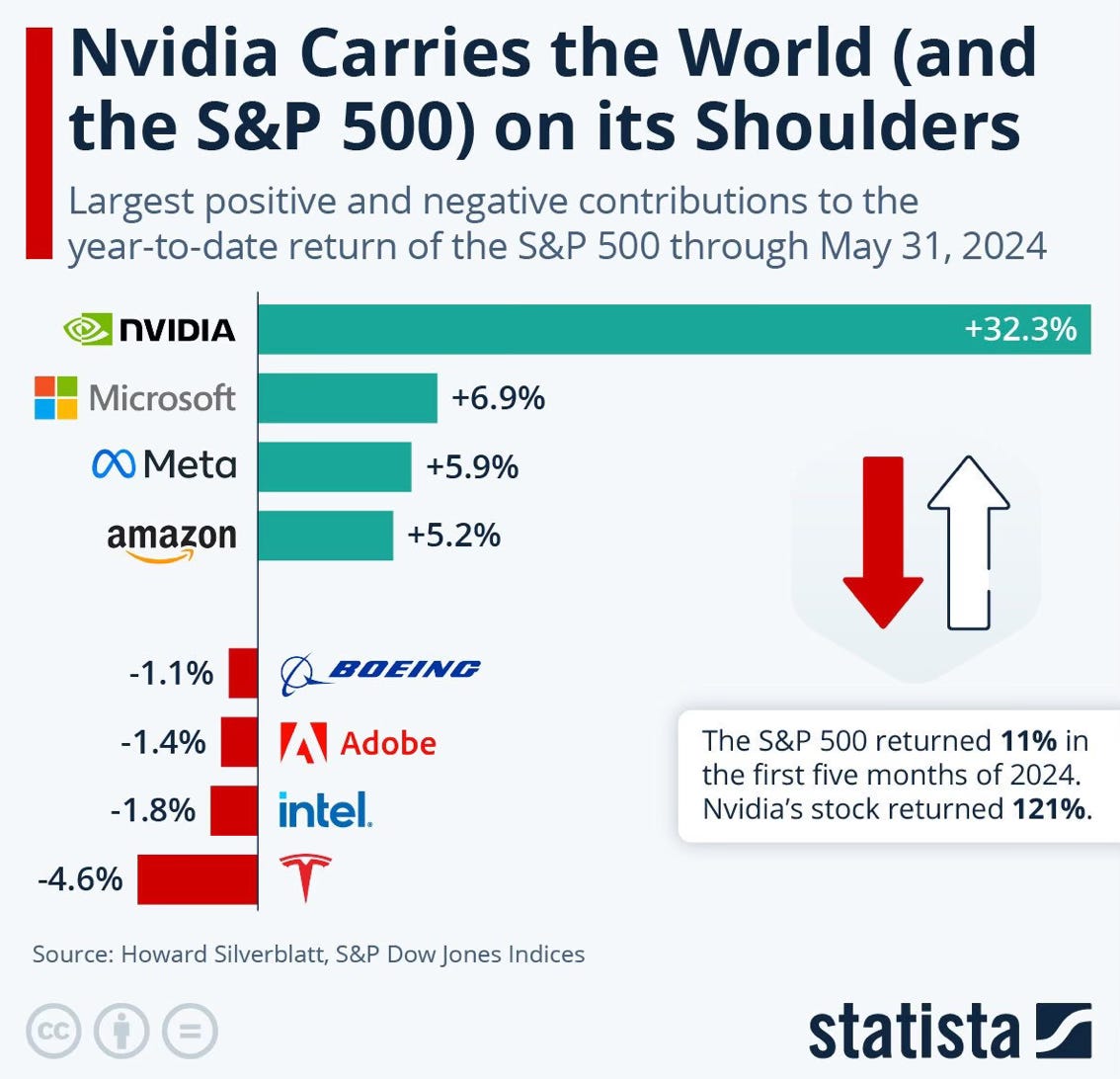
This is a great visual to see just how much Nvidia has contributed to the YTD return of the S&P 500 through May. Tesla has been the biggest drag so far YTD.
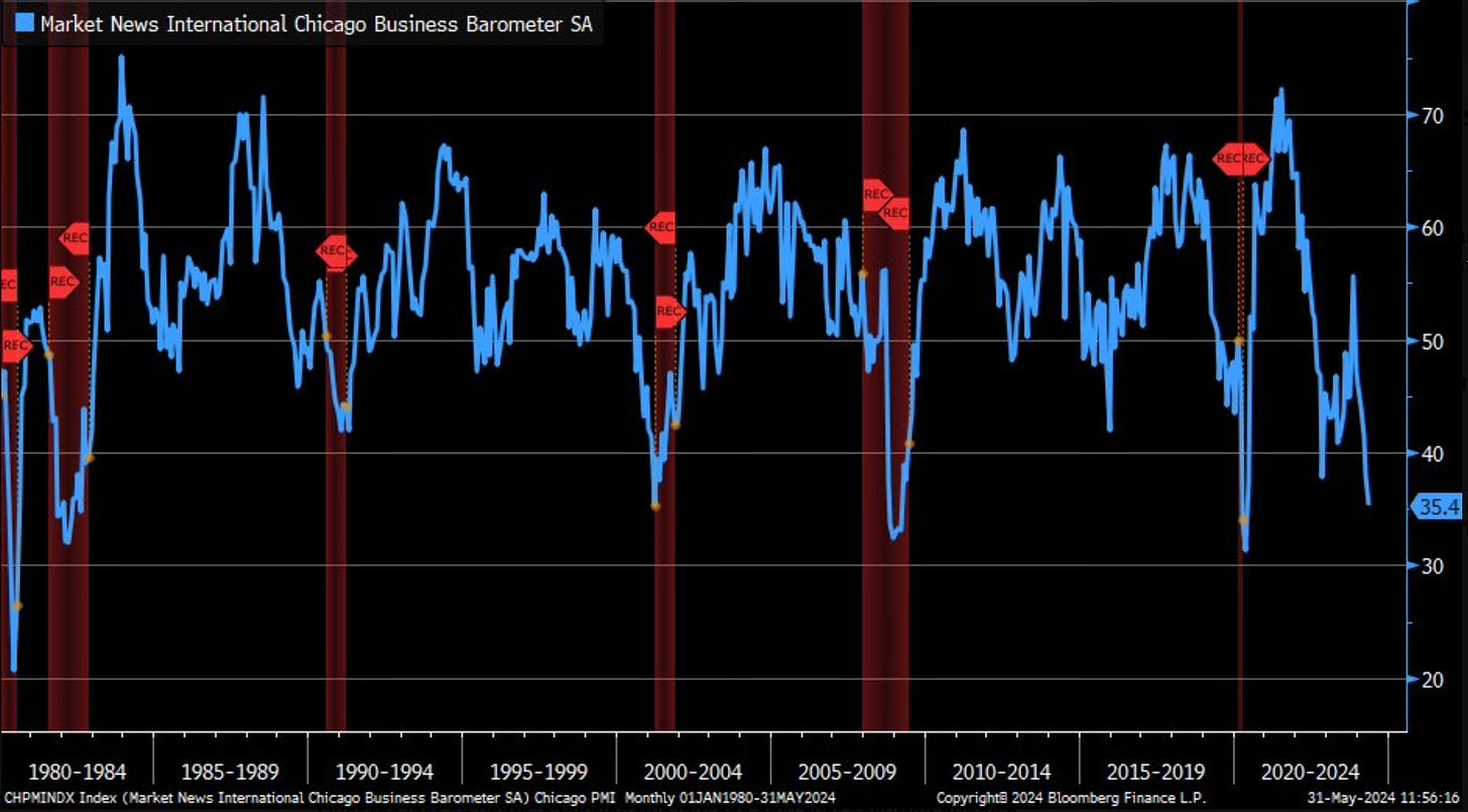
Manufacturing Worries?
This week provided some concerning data out of the Chicago PMI reading. It came in at 35.4. That’s the lowest reading since May 2020. This is now the 6th straight month of the manufacturing industry contraction in the Chicago area. Is this signaling something?
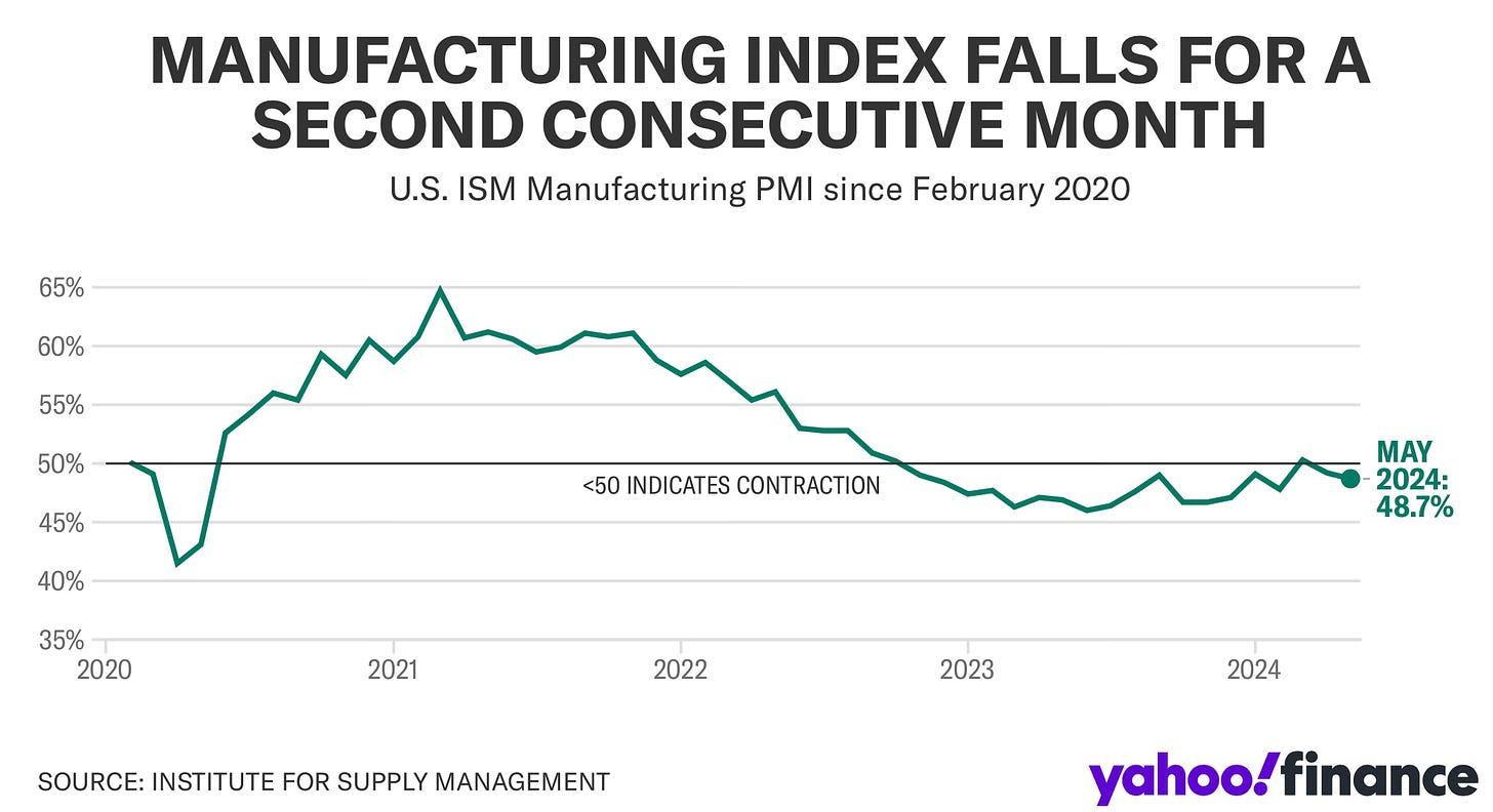
The ISM manufacturing PMI also came in lower than expected. It registered a reading of 48.7 in May. Lower than the estimate of 49.5. This now makes two months of declines. These are the type signs that start to show when we see an economy start to slow down.
No This Isn’t A Bubble
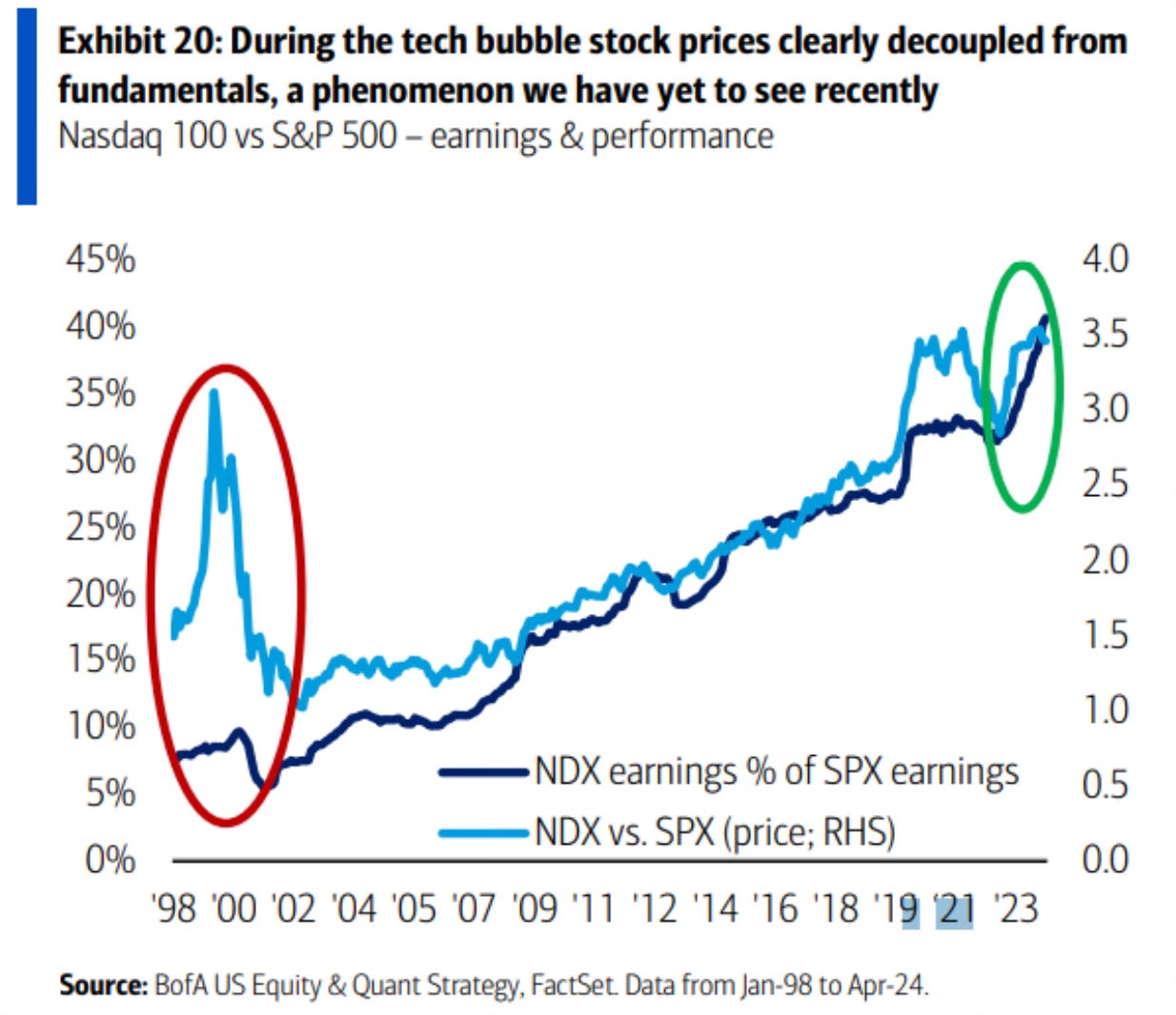
It seems anytime the stock market reaches all-time highs the talk about bubbles start to increase. The tech run led by the new AI innovation has continued to get comparisons to the dot-com bubble. Many things are different versus back then. But for now, let’s just stick to some recent data comparisons of the two periods.
The biggest difference is that you can see in this chart is that the fundamentals became completely disconnected from stock prices in the dot-come bubble. Just severely out of whack. Currently those fundamentals have remained in line.
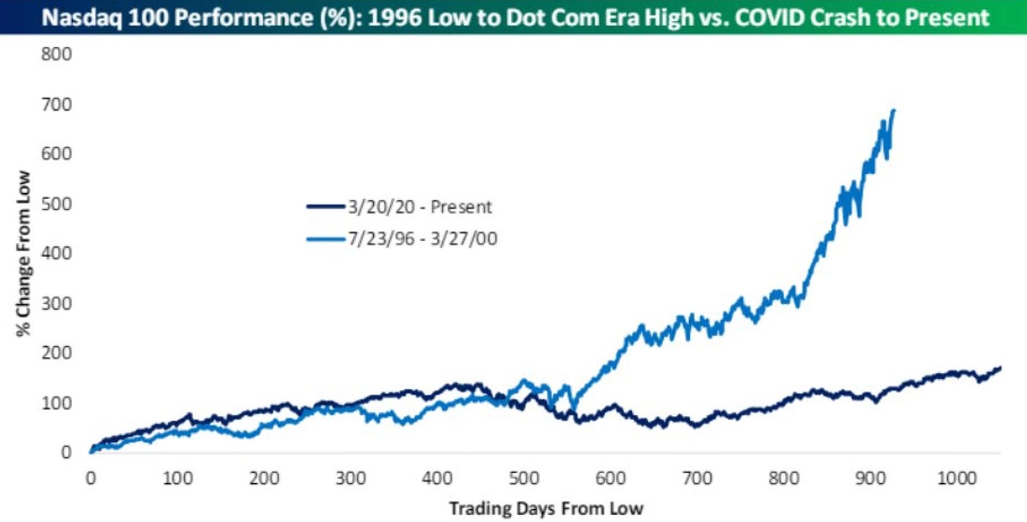
The next is this chart of the Nasdaq which compares the 1996 low point to the dot-com high to the pandemic crash low to today. From July 1996 to March 2000 the Nasdaq rallied 700%. Since the March 2020 low to now the Nasdaq has only rallied 200%.
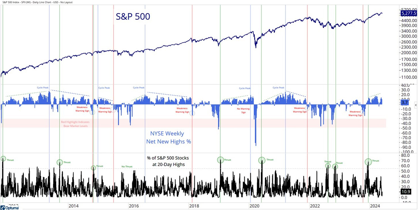
When we look at the internals of this bull market, I like to refer to this chart that Grant Hawkridge does. He recently updated it and I love his very simple description of what it’s saying.
There has yet to be a weakness warning signal... keep calm and carry on with the bull market
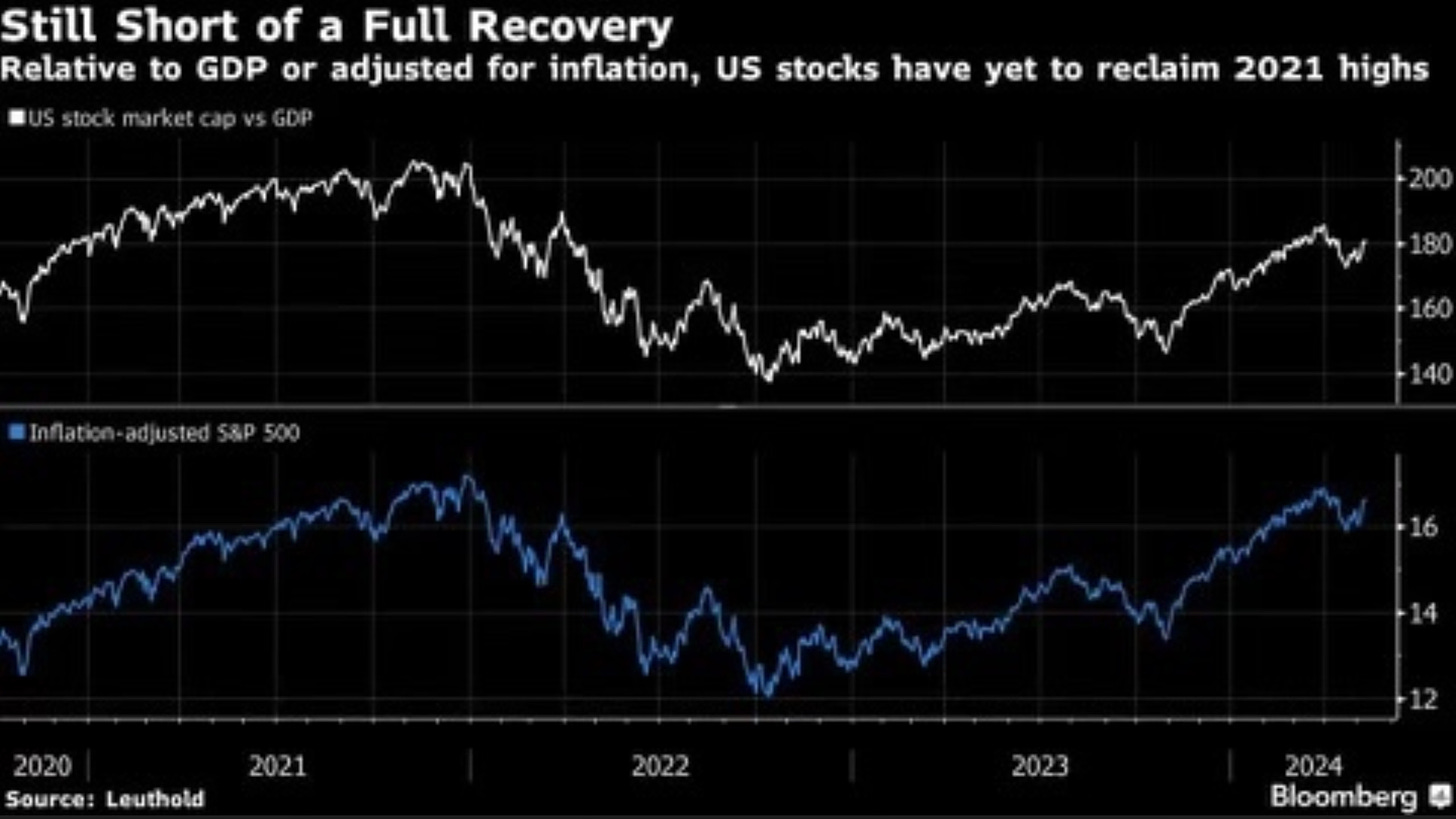
A friend and subscriber shared this chart with me this week. It points out that relative to GDP and adjusting for inflation, US stocks have yet to even reclaim their 2021 highs. I didn’t realize this.
To me this current bull market is only like the dot-com bubble in three ways. None of which are correlated by data. There is a new technology coming out. This time it’s AI, back then it was the internet. There is one hot stock leading the way right now in Nvidia, back then it was Cisco. The last is that the market is at all-time highs just like back then.
This is coincidental dot connecting. Not comparable data and fundamentals. That’s a big difference.
I don’t think we’re near bubble territory at all and I side with what Jurrien Timmer said in describing this chart. I absolutely love this chart by the way.
The current bull market cycle is 20 months old and produced a 53% gain. By historical standards there seems to be life left for this bull, given the median 30 months and 90% gains that’ve been produced over the past 100 years or so. We might only be in the 5th inning.
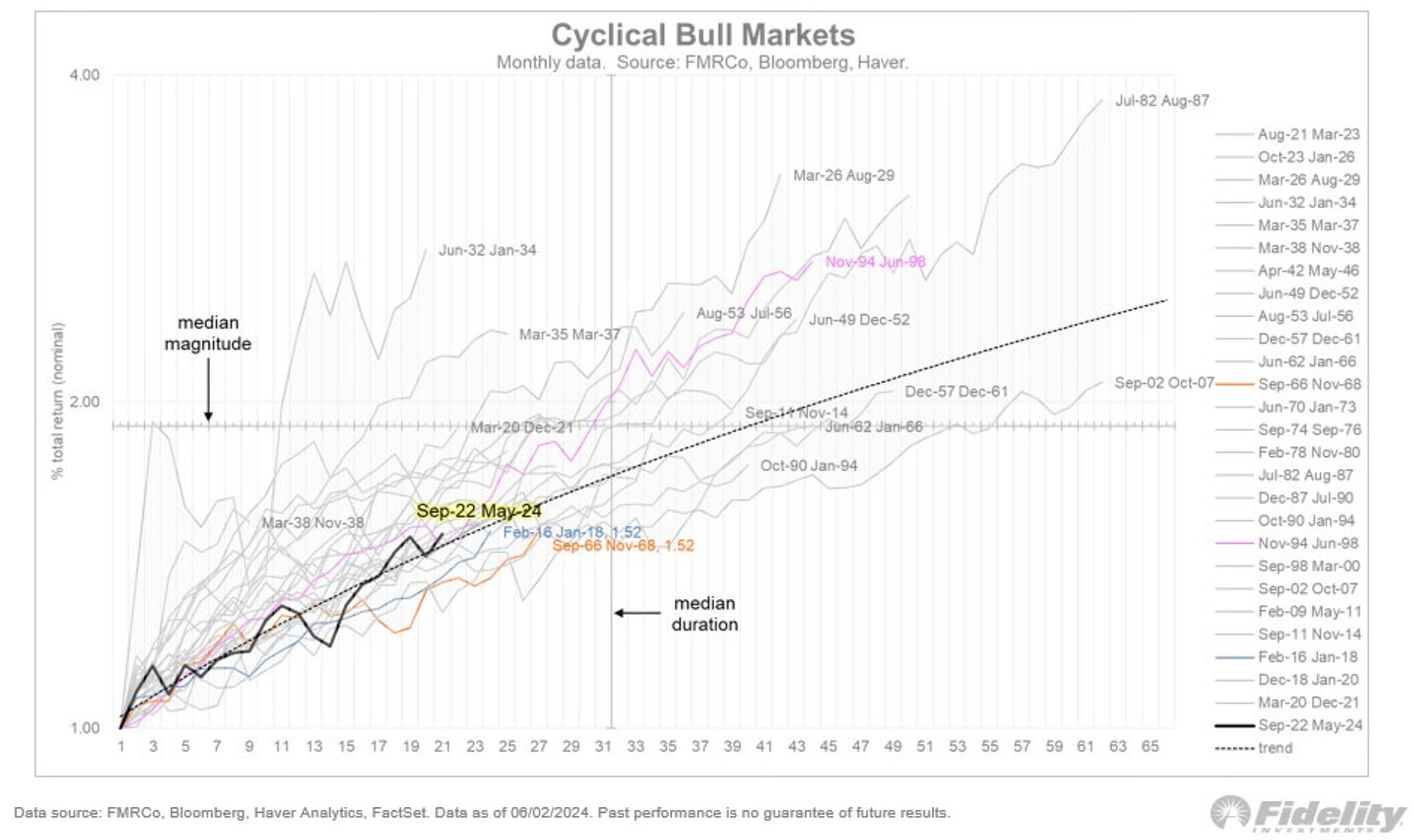
The 5th inning? I will agree with that. I still think the market remains on a smooth road until we reach the uncertainty and time nobody ever looks forward to, election season.
Don’t fall for the bubble talk and that the stock market has to come crashing down. Nothing supports that right now other than the fearmongers who are trying to spread fear and connect dots. So please stop throwing around the bubble talk so loosely.
Moves I’ve Made
S&P 500 Index This week I added to my S&P 500 index position.
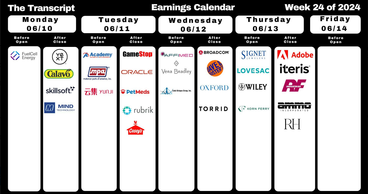
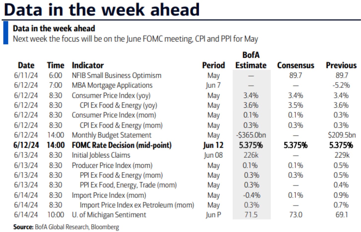
Upcoming Earnings & Data
Next week is a light week in earnings with only 6 S&P 500 companies reporting.
The Coffee Table ☕
I found Nick Maggiulli’s post Is Maximizing Credit Card Rewards Worth It? to be quite informative. I learned some things about credit cards that I wasn’t aware of. A great article for young adults to read.
We heard a lot of talk about the yield curve being inverted a while back. Well it's still inverted and has been now for the longest stretch on record. This is a great article that gets you up to date on Wall Street’s favorite recession indicator. Wall Street’s Favorite Recession Indicator Is in a Slump of Its Own
Jennifer Kingson had good post on restaurants. Restaurants are having their biggest year ever As Spilled Coffee readers know I’m a huge foodie that travels far and wide to great restaurants, so this article made me smile. Very happy to hear this about restaurants after all they had to go through a few years ago.
If you want to read about the US consumer and spending then I really recommend this article in
by . Is Consumer Spending Slowing? The Overshoot is one of the best places to read on consumer spending, inflation and the macro economy.
Thank you for reading! If you enjoyed Spilled Coffee, please subscribe.
Spilled Coffee grows through word of mouth. Please consider sharing this post with someone who might appreciate it.
Order my book, Two-Way Street below.


